Cognos Analytics Overview
Cognos Analytics Reporting, along with the Banner Operational Store (ODS) and Banner Enterprise Data Warehouse (EDW), allows business users at all levels of the institution to have near-time access to operational data formatted in a manner that facilitates reporting.
Faculty and staff who wish to build reports in Banner ODS need to have an account set up and attend training. To log into Cognos, follow How to log into Cognos.
Click on the link below to jump to a section.
- Help Available
- How to log into Cognos
- Cognos Analytics
- Scheduling and Subscriptions
- Jobs
- Cognos Analytics Reporting
Data Protection Guidelines
Policies and procedures are consistent with overall institutional policies regarding release of student information as outlined in the Release of Student Information memo and the FERPA Summary document from the Office of the Raider Student Services to ensure compliance with the Family Educational Rights and Privacy Act (FERPA) and in the Acceptable Use policy in A Guide to Computing Resources.
- We may not disclose any information about students, other than directory information, to unauthorized persons or organizations. Non-disclosable information includes things like social security number, grades, academic standing, which classes a student is enrolled in, how many credit hours the student has earned, test scores, student disciplinary records, and any other information considered an education record.
- Directory information at SOU includes: name, local and permanent addresses and telephone numbers, date and place of birth, academic major, participation in officially recognized activities and sports, dates of attendance, enrollment status, degrees and awards received, and the most recent previous institution attended. We cannot release any information, even directory information, for a confidential student. We cannot even acknowledge that the student is at SOU.
- Data which is identifiable to particular individuals (e.g. inclusion of names, social security numbers, student ID's, addresses, telephone numbers) shall be used only by persons with a legitimate educational interest and within the scope of the individual's responsibilities (e.g. instructors may access data for classes which they teach, departments for their majors, etc.). A legitimate educational interest means that the person is required to perform certain duties and these duties involve the use of student data.
- Any release of individual or aggregate student information to anyone outside of SOU who have a legitimate educational "need to know" must be authorized by the Office of the Raider Student Services consistent with a written request stating the use of the data.
- Anyone with Banner ODS access must ensure that such data is not available to individuals who do not have access to the same data via a normal Banner account or who do not have a legitimate "need to know". The individual with Banner ODS access is responsible for providing security and auditing that security on a regular basis.
- The actual data is made available only in Banner ODS via an authorized user ID and password. Data which is saved locally must be adequately protected from outside access. We recommend that you password protect all saved data files and use the Windows workstation locking feature or screensaver password on all of your computers with this data. Saved data must be updated frequently enough such that the likelihood of incorrect data being used is minimized.
- Requests for data or the use thereof which are outside the users' scope must be authorized in advance by the Office of Raider Student Services consistent with a written request stating the use of the data.
- Requests (or subpoenas) for individual or aggregate student information from law enforcement authorities (including campus security, FBI, CIA, District Attorney) or legislative officials should be referred to the appropriate executive dean.
- Printed reports with student ID's, social security numbers, confidential students, or FERPA protected data should be kept in a protected environment and shredded when disposed of.
Glossary
- Attribute - A building block of information within a view. Many attributes in a view come directly from fields in the source database (Banner). Other attributes are derived either through calculations or the logic defined in a function.
- Banner Enterprise Data Warehouse (Banner EDW) - An informational database that enables an institution to keep time slices of data over time, over history, stored for easy retrieval and comparison. The Enterprise Data Warehouse is an extension of the Operational Data Store, which is the primary source of aggregated and detailed data.
- Banner Operational Data Store (Banner ODS) - The primary source of aggregated and detailed data is comprised of over 300 reporting views containing data across subject areas applicable to higher education. Because of the size and scope of the Banner ODS data model, reporting views are grouped into logical business concepts to better illustrate the various business uses. The data models are grouped into the following sections : Accounts Receivable, Common, Finance, Financial Aid, Human Resources and Student.
- Cognos Analytics Reporting - Create and edit a wide range of reports. Use templates or customize your reports with prompts, bursting, advanced charts and visualizations.
- Crosstab Report - Use crosstab reports, also known as matrix reports, to show the relationships between three or more data items. Crosstab reports show data in rows and columns with information summarized at the intersection points.
- Dashboards - View monitor and communicate data insights and analysis with dashboards. You can assemble a view that contains visualizations such s graphs, charts, plotts, tables, maps or any other visual representation of data.
- Data Item (Query Item) - A representation of a column (fields) of data in a data source. Data items may appear in a model or in a report and contain a reference to a database column, a reference to another data item, or a calculation.
- Data Modules - Contain data from uploaded files, data sets other data modules and from packages. Data modules can be used as sources for reports, dashboards, stories, explorations, data sets and other data modules.
- Data Objects (Query Objects) - The tables of information stored in the database. They have additional information, or data items, associated with them.
- Dimension - A structural attribute of data that consists of pieces of information of a similar type. A Geography dimension, for example, may contain data about regions, countries, cities, states. A time dimension contains year, month, day and hour members. A multidimensional data structure allows data to be organized and analyzed in a concise, efficient way.
- Facts/Measures - Numbers that are related to the attributes. Facts and measures (the terms are synonymous) generally represent counts, sums or percentages and other ratios. They may be stored and retrieved or calculated from stored measures as the query is executed.
- Filter - A filter is used to defined or restrict the data that is shown on a report.
- Grouping - In reporting, the process of organizing common values of data items together and only displaying the value once.
- Incremental Refresh - Data in the Banner ODS is updated, or refreshed, at predetermined intervals of time (nightly). Only the data that has changed in the source database (Banner) since the last refresh is updated.
- List of Values - A list of values is a set of valid values (codes) for a column in a reporting view. A List of Values generally includes the description along with the code.
- Model - A physical or business representation of the structure of the data from one or more data sources. A model describes data objects, structure, and grouping, as well as relationships and security. In Cognos, a model is created and maintained in Framework Manager. The model or a subset of the model must be published to the Cognos server as a package for users to create and run reports.
- My Content - This folder is your private area. Only you can see the content stored here. Formerly known as My Folders.
- ODS Business Concepts - Business concepts are used to organize the data available for different reporting requirements. A business concept shows the relationships between the data supporting a set of business processes. Because different business processes often require different perspectives on data, the relationships among the supporting database objects need to change based on the being performed.
- ODS Composite View Meta Data - The composite views gather Banner source data necessary to populate and maintain the information stored in the Banner ODS.
- ODS Reporting View Meta Data - Meta data in Banner ODS tells what data columns are in Banner ODS , a definition of their business use, the type of data (number, character, date, etc.), how long they are, where they come from (in the source system) and their destination (in the target system).
- Package - A package is a subset of data in Cognos designed to support a specific set of reporting needs. They are used by Cognos Analytics Reporting to access data for the reports being built. Within the various Cognos tools you can report against only one relational package at a time. When creating a new report, you select which package to use.
- Prompt - A prompt is used to create a list of values that can be selected from. The report will be built (or filtered) based on the prompts selected.
- Recent - This folder contains items that you viewed recently.
- Relationships - How the data objects are joined together. They allow users to create reports using more than one data object.
- Slotted View - Slotted views group similar information in one row instead of multiple rows to make reporting simpler. An example could be Student holds. Instead of having separate rows for each hold a student has, there would be one row with up to 5 holds in separate fields. Which holds show in the slotted view is based on Display Rules that are defined by the Institution. The number of slots in different slotted view varies.
- Sort - Presentation options for organized appearance. Puts the data in alphabetical or numerical order that is either in ascending or descending order.
- Source Function - Functions that use data from the Banner tables to create new data that is stored in the Banner ODS.
- Schedules - You can schedule entries to run at a later time or to run at a regular interval. My Schedules and Subscriptions under Personal Menu lets you see what is setup and allows you to edit, disable or remove entries.
- Source Table - Tables from the Banner database where the data is coming from.
- Stories - Type of view that contains a set of scenes that are displayed in sequence over time. Types of stories include slide show and guided journey. Stories are similar to dashboards because they also use visualizations, but differ because they provide an over-time narrative and can convey a conclusion or recommendation.
- Subscribe - If you use a report regularly, you can subscribe to it. After running a report, click on the Action menu (...) in the application bar and select Subscribe. When you subscribe you pick the time, date, format, prompts and where you want it delievered. My Schedules and Subscriptions under Personal Menu lets you see what is setup and allows you to edit, disable or remove entries.
- Target View - Banner ODS reporting views that contain information from the related Banner tables.
- Team Content - The organanization's (SOU's) content. This is where you find reports, portal pages and packages. Formerly known as Public Folders.
- Uploaded Files - For quick analysis, you can upload files to Cognos Analytics yourself. There is file size limitations that apply. Files that can be uploaded are Microsoft Excel files and delimiter-separated files
- Visualizations - Graphical interpretation of the data. Cognos Analytics Reporting can be used to create many types, such as column, bar, area, and line charts.
Help Available
We have several different methods of help available for Cognos and Banner ODS:
- Banner ODS Meta Data - Each Banner ODS Business Concept will contain a list of all reporting views available along with a list of all Banner tables used to pull into Banner ODS. The list of Banner tables can be used to see what fields are getting pulled in from Banner.
- Banner ODS Business Concepts - Each Banner ODS package have a Banner ODS Entity Relationship Diagram available. Each diagram shows all of the tables within the package and their relationship to each other. Click on a table to show all of the fields. The information includes the table name, table description, field names, business name and description, the field format (i.e. character, number) and the Banner source of the data item.
- Help Menu within Cognos - The Help menu in Cognos is the Question Mark (?) on the menu bar. Click on this then the link to the Knowledge Center to access thorough Cognos documentation.
- Cognos Documentation- There are various sets of Cognos documentation available.
- Help Desk - Log a call directly to our helpdesk system by emailing your question to data-warehouse@sou.edu.
Back to Cognos Analytics Overview
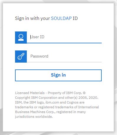
How to log into Cognos
InsideSOU provides access to Cognos along with many other applications. When you access Cognos from Online Services within InsideSOU, it will open up Cognos in a new browser tab or window.
- Get into a browser. Cognos works with Chrome, Edge, Safari, Opera and Mozilla Firefox. You cannot use Chrome to work with the older studio products (Query Studio and Analysis Studio)
- Log into InsideSOU.
- Click on one of the Cognos links in the Online Services block.
- Cognos Home - This will go the portal page you have designated (I*Reports, FIS Reports) or the Cognos Analytics Welcome page.
- Cognos-FIS Reports - This goes to the FIS Reports home page in Cognos. You can use this if you have access to the FIS Reports.
- Cognos-I*Reports - This goes to the I*Reports home page in Cognos.
- Enter your Network username and password and click OK.
Back to Cognos Analytics Overview
Cognos Analytics Welcome Portal
Cognos Analytics Welcome Portal is user interface to Cognos. Cognos Analytics Welcome portal provides a single access point to all SOU data and reports you have permission to see in Cognos. You can use Cognos Analytics to access reports, portal pages, and dashboards. You can also use Cognos Analytics to create, schedule, subscribe to and distribute reports.
- Sign In - To use Cognos software, you must successfully sign in. During the sign in process, you must provide your network user ID and password.
- Log Out - You log out (under Personal Menu) to end your session. Your session also ends if you close your web browser without signing out.
- Home - The default home is the welcome page. You can make a portal page your home by going to the portal page then click on the Action menu (...) on the application bar to set as home. Change home back to default from the Personal menu.
- Search - To find items, type keywords and click on the enter key. You can also search for text including table or column lables. If your search returns too many results you can click on the filter icon and select options you want. After you search and the results are listed, you can save your search.
- My Content (My Folders) - This folder is your pivate area and only you can see the content that is stored there. This was called My Folders in Cognos 10.
- Team Content (Public Folders) - This is where SOU's content is. This is where you find reports, portal pages and packages. This was called Public Folders in Cognos 10.
- My portal pages - This is where your I*Reports or FIS Reports tabs went. You can add a portal page to your list by going to the portal page (or a shortcut to it), clicking the More button and selecting Add to My portal pages.
- Recent - This folder contains items that you viewed recently. Use the List View and the Tile View icons to switch between views.
- Upload files - Files can be uploaded to create data modules, do explorations or add to dashboards. Tap the New (+) menu and select Upload Files. Locate the files on your local drive. Select one or multiple files to upload them. The uploaded files are stored in your My content. If the file already exists it will ask if you want to append or replace. Reporting can't use uploaded files directly. However they can be incorporated into a data module which can then be used as a source in Reporting.
- Navigating between views - You can have multiple entries such as folders, reports and portal pages that are opened. The welcome menu is in the center of the application bar. It is a convenient way to navigate bwtween the different open views.
- New - Create new content from the New menu. Use Reporting to create new reports. For access to Cognos legacy UI (Query Studio, Analysis Studio and Drill-Through definitions), under New, select Other.
- Action menu (...) - The Action menu link (...) in the application bar allows you to Set as home the current portal page you are on. It does not set the Team Content menu level that you are in as your home (like Cognos 10 did). When you are viewing a report, there is a link under Action menu to Subscribe to the report.
- Notifications - If you subscribe to a report or report view or if you have a scheduled reports, you can be notified when the report is available.
- Personal Menu - Use personal settings to customize your Cognos Analytics experience. To view or change your settings, click the Personal menu icon in the application bar. To log out select Sign Out under the Personal Menu.
- Help - The Help menu in Cognos is the Question Mark (?) on the menu bar. Click on this then the link to the Knowledge Center to access thorough Cognos documentation.
This document contains basic information on how to use Cognos Analytics. For detailed information on how to use all of the features, refer to the following IBM Cognos Analytics Getting Started User Guide.
Navigation Tips
- Running a report - To run a report from the My Content or Team Content list, tap the name of the report or choose Run as from the Action Menu which appears as a vertical elipsis to the right of each item if you are in list view or will appear if you hover in the top right corner of any item when you are in tiles view.
- Select entries in lists - First choose list view, then check the check box to the left of each entry you wish to select from the list.
- Add a folder - To add a folder to My Content or Team Content (Dropbox), open to the location within My Content or Team Content and tap the New Folder icon (+) in the toolbar.
- Navigate between views - You can have multiple entries such as portal pages and reports that are opened. The welcome menu in the application bar prvides a convenient way to navigate between the different open views.
Personal Menu
Use personal settings to customize your Cognos Analytics experience. To view or change any of the personal settings, click the Personal menu icon in the application bar.
- Profile and settings - view and update profile and settings
- Profile tab
- Email address - displays your email address.
- Advanced options
- Credentials - Your credentials are the user name and password that you use to sign in to IBM Cognos Analytics. If you change the password you use to sign in to Cognos Analytics, be sure to renew your credentials. Your saved credentials are used to run scheduled requests when you're not signed in, for example, overnight. Credentials are automatically renewed once a day, but a schedule run can fail, if it runs after you change your password, but before your credentials are automatically renewed.
- My Credentials - no actions are available / centrally managed.
- Data Server Credentials - no actions are available / centrally managed.
- Groups and Roles - Shows a list of groups and roles your account belongs to.
- My capabilities - Shows a list of capabilities available to your account.
- Logging - enable, disable, and define level of logging. In addition to the logging capabilities that exist on the IBM Cognos server, you can produce logs and error reports for your own workstation. This type of client-side logging is important for troubleshooting and can cover JavaScript anomalies that are not detectable from the server environment.
- AI Learning - slider, allow or don't allow
- Settings tab
- Home page - This setting will show you if your home is currently the default. If it isn't it gives you the option to change back to the default.
- Set home as (current view) -- Click Set to make current page your home page.
- Welcome banner - slider, off or on
- Accessibility features - slider, off or on
- Content settings
- Show hidden entries - slider, off or on
- Report format - choose default report format from the drop-down list
- Regional options: time zone, language selection / support - choose from the dropdown list the language you prefer for the cognos Analytics user interface. New languagee setting will take effect after the browser is refreshed.
- Profile tab
- My Inbox - shows status from schedules, subscriptions, etc.
- My schedules and subscriptions - View all of your scheduled activities and subscriptions here. My Schedules and Subscriptions lets you see what is setup and allows you to edit, disable or remove entries. You can view a list of your scheduled activies that are current, past or upcoming.
- My Watch Items - alert lists and watch rules used to monitor business events.
- Log my session - Session logging is used to enable detailed, diagnostic logging for your current Cognos Analytics Session - Click this menu item to access the button turning session logging on and off.
- About - Shows the current release version of Cognos Analytics.
- IBM Cognos Analytics Mobile - information about using Cognos on your mobile device.
- Sign Out - Log out of Cognos. You will also be logged out if you close the browser window.
Properties
Properties are arranged in four tabs: general, report, schedule, and permissions. To access properties, locate the object you wish to see properties for in the Content folders, then right click and choose Properties from the menu.
General
- Name - The name of the entry.
- Description - An optional description of the entry. It appears in the portal when you set your preferences to use the details view. Details view appears only in Public Folders and My Folders.
- Permissions - your permissions to the entry.
- Hide this entry - When selected, this object is no longer visible in the portal.
- Disable this entry - When selected, users that do not have write permissions for this entry cannot access it.
- Source package or data module - The package that is associated with the entry. If the source package was moved or deleted, the text reads "Unavailable." Click Link to a package to link the entry to a different package.
- Location - The location of the entry in the portal and its ID. Click View the search path, ID and URL to view the fully qualified location and the ID of the entry in the content store. Entries are assigned a unique identification (ID) number.
Report
Report Properties appear on the Report tab of the Properties.
- Source - The package that is associated with the entry. Read only here. Update under General Properties.
- Prompt for values - Radio button indicating the report will prompt (or not) for values that are used to filter when the report is run.
- Current values - Select Set Values to set the parameters to be used for the report.
- Report
- Format - The default format or select a specific format (Excel, PDF, CSV, HTML).
- PDF options - Set PDF options
- Enable accessibility support - Whether to create report output that supports accessibility. Enabling support creates report output that can be read by a screen reader.
- Language - The default language to use for the report data when the report runs.
- More options
- Display of run history - number of runs shown
- Occurrences - Days/Months
- Default portal action - choose from list: view most recent, run, and edit.
- Rows per page - select for HTML reports
- Enable selection-based interactivity - slider (off or on) - Whether to enable the following in HTML reports that are viewed in Cognos Viewer: drill up and drill down, drill through, Cognos Search, watch rules, and agent notification. Note that to have watch rules evaluated in saved report output, you must select the Enable enhanced user features in saved output versions check box.
- Enable alerts about new versions - slider (off or on) - Whether to allow report consumers to receive alerts (notifications) about new versions of a saved report. If this check box is cleared, you are prompted whether to remove all users from the alert list.
- Run - choose
- With user's credentials
- With owner capability
- As a specific user
Schedule
See below ..
Permissions
Set access permissions to specify which users, groups, or roles can access your content. You can set permissions for content that you own, such as reports, dashboards, stories and packages. This only needs to be done on content in the Team Content area where other people may access it. Permissions tab is under Properties.
- Override parent permissions - Whether to replace the permissions that are inherited from the parent entry.
- Access permissions (Name, Type, Permissions) - The permissions that are set for the entry. You can grant or deny read, run, write or full. Click on the access icon to change the permission. Click the add + iccon to add more names, groups or roles to the list. Click Delete to delete names, groups or roles from the list.
- Inherit access permissions to all child entries - Whether to apply the existing access permissions for all child entries. Select the Apply to all children check box.
Dropbox - Sharing Personal Reports with Others
If there is a report that you want to share with one or more people, you can use the dropbox folder to pass the report. This is a place to temporarily put reports that others can retrieve. This folder will occasionally be purged.
- Log into Cognos Analytics.
- Go to your My content area.
- Locate the report you want to share. Click on the Action Menu icon (vertical ellipsis ... ) and select Copy or move to.
- Click on Team content tab then click on Dropbox.
- Click on the Copy button. Your report should now be in the Dropbox folder.
- The person who wants a copy of the report must now log into Cognos Analytics to retrieve it.
- Open the Content folder, then Team content tab, then Dropbox folder.
- Locate the report. Click on the Action menu icon (vertical ellipsis ...) and select Copy or move to.
- Click on My content tab then navigate where you want the report.
- If multiple people are getting a copy of the file, click on the Copy button. Otherwise click on the Move button.
Setting Up Reports to Run on a Schedule
Single or groups of reports can be scheduled to run at a regular interval with the results being emailed to you or a group of people. Before you can set up reports to be scheduled, you will need to have Author access in Cognos (you can create reports).
To Schedule one report to run on a regular basis.
- Log into Cognos Analytics.
- Go to the report you want to run regularly.
- Click on the Action menu link (...) and then click Properties
- In the Properties pane, click the Schedule tab and then click New.
- In the Create Schedule pane, specify the schedule options. This includes how often, start and end date, format (HTML, Excel, PDF, CSV), delivery (save, email) and prompts.
- You can update the schedule in the Properties or by selecting My Schedules and Subscriptions under your Personal Menu.
To run multiple reports at once or in a sequence on a schedule.
- Log into Cognos Analytics.
- Click on the New (+) icon then click Job. The Steps page appears.
- Click on the Add job step icon.
- Navigate to a report you want to include in your job step. Select it and then click Add job steps.
- To update individual defaults, click on the pencil icon (Edit) for each report and and then edit the format, delivery, prompts, languaages or accessibility options..
- Repeat stops 3 to 5 to include additional steps in your job.
- To remove a step, hover over the step and then click the Remove job step icon.
- Under Run order, select whether the steps should Run all at once or Run in sequence. If you select Run in sequence, the steps are executed in the order they appear in the steps list. If you want the job to continue to run even if one of the steps fails, select the Continue on error check box.
- In the application bar, click the Save icon. Navigate to a folder to save the job.
- The Run Now and Schedule links appear in the Run Options section.
- To run the report immediately, click Run now and click Finish.
- To schedule at a recurring time, click Schedule (under Run Now button), click New then enter the details of when you want the job to run. Click Create to complete.
- The job is now in the folder you selected when you saved it.
To update the scheduled running of a report or job.
- Log into Cognos Analytics.
- Under your Personal Menu, select My Schedules and Subscriptions.
- Go to the report or job you want modify the schedule for.
- Click on the Action menu icon, then select Modify this Schedule.
- Click on the Update schedule icon (greater than sign)
- Make changes and click on Update.
To stop the scheduled running of a report or job.
- Log into Cognos Analytics.
- Under your Personal Menu, select My Schedules and Subscriptions.
- Go to the report or job you want disable or remove.
- Click on the Action menu icon, then select Disable this schedule or Remove this schedule depending on what you want.
Back to Cognos Analytics Overview
Cognos Analytics Reporting
Cognos Analytics - Reporting is a web-based report authoring tool used to build reports. Reporting allows you to create reports with relational or dimensional data sources, and show data in lists, crosstabs, and charts. You can also use your own external data source.
This document contains basic information on how to use Cognos Analytics - Reporting. For detailed information on how to use all of the features, refer to the following IBM Cognos Analytics Reporting User Guide.
Launching Cognos Analytics - Reporting
There are a couple ways you can open Cognos Analytics - Reporting
- From Cognos Analytics, open the left menu, then select New (+) Report.
- From Cognos Analytics, open the left menu, choose Content, locate the report, then Edit report from the Action menu for that report.
Working in Cognos Analytics - Reporting
To create reports in Cognos Analytics - Reporting, you must become familiar with the Cognos Analytics - Reporting environment, including the user interface, the basic report layout, and setting options.
The User Interface
The Cognos Analytics - Reporting user interface has a work area, content and properties panes, a page layers area, and a context filter area to help you create reports.
- IBM Cognos Analytics Reporting User Interface
- Navigation menu - You can navigate through the pages, prompts pages, queries classes and variables in a report by selecting an item in the navigation menu.
- Objects of the report - Select an item in the navigation menu to see a navigation drop-down menu. Select an object in the navigation drop-down to see the properties for the object on the canvas.
- Navigation buttons - The two arrow buttons next to the navigation menu allows you to Go forward and Go back through the objects in the report.
- On-demand toolbar - The on-demand toolbar (formerly known as the report object toolbar) contains the actions you can perform on an object. The following list shows the actions that are available from the on-demand toolbar. The actions that appear depends on the type of object that is active on the canvas. If you don't see all of the items (like the Action menu vertical ellipsis symbol), expand the width of your window or collapse your properties pane.
- Pin/Unpin - When the on-demand toolbar is pinned, it stays at the upper left corner of the canvas, regardless of which object is active. When it's unpinned, it floats near the object that is active.
- Cut, Copy, Paste and Delete - Cut, copy, paste or delete an object.
- Filters - Click the down arrow next to the filter button to add, edit, or delete filters or add filter text to the visualization
- Sort - Click the down arrow next to the sort button to ascending, descending, no sort or edit sort order. When sorting by more than one column, you will need to edit sort order.
- Summerize - Click the down arrow next to the sumerize button to select different calculations.
- Insert Calculation - Click the down arrow next to the sumerize button to select different calculations.
- Swap rows and columns - In a crosstab report, switch the row and columns around.
- Group/Ungroup - Group data items in a list report to remove duplicate values. Select column(s) you want to group then click the Group/Ungroup icon from the On-Demand Toolbar.
- Section/Unsection - Create sections in a report to show a data item as the heading of a section. When you run the report, separate sections appear for each value. Click the column to make the section heading then click on the Section/unsection icon from the On-Demand Toolbar.
- Apply style - Apply a custom or default style.
- Font - Edit the font for an object.
- Border - Apply a border. You can choose the style, width, and color.
- Background color - Apply a background color.
- Data Format - To modify the format of an object, select the object then click on teh Data Format icon from the On-demand toolbar. Select the format type then update any specific Properties that are applicable.
- Horizontal alignment - Change the horizontal alignment.
- Vertical alignment - Change the vertical alignment.
- Style current selection - Create and apply a custom style to the selected object.
- Apply layout - Select a different layout for the report.
- Insert table - Insert a table.
- Select ancestor - Select an ancestor of the current object.
- Action menu (...) - Other actions that vary, depending on the type of object that is active. For example, for a visualization, you can change the headers and footers. For a table, you can apply a table style. For a table cell, you can build a prompt page.
- Insertable objects - 3 tabs of things you can add to your report.
- Sources Tab - The Sources tab contains items from the package selected for the report, such as data items and calculations. Search through the sources by typing a value in the Find field. As you type, the items that match your search string appear in the tab. Hover over the item to see what table it is coming from.
- Data Items tab - Shows the queries in the report (items selected)
- Toolbox Tab- The Toolbox tab contains a variety of objects that you can add to a report, such as calculations, prompts, text and visualizations. Depending on the type of object, you can drag it from the Toolbox to the canvas or double-click on it to open a window in which you define values for the object. When the object is placed on the canvas, its properties are displayed in the properties pane.
- Text Item- Inserts a text item. The content can be static text or it can come from a query item or report expression.
- Block - Inserts a container in which you can insert other objects.
- Table - Inserts a table in which you can insert other objects (reports, graphs, etc.).
- List - Inserts a list container that is used to present query results in a list fashion.
- Crosstab - Inserts a crosstab container that is used to render the results of a query that aggregates data and then arranges it in a two-dimensional grid.
- Visualization - Inserts a visualization in the report.
- Query Calculation - Inserts a new row or column whose value are base on a calculation.
- Layout Calculation - Inserts a calculation into the report layout. Use layout calculation to add runtime information to a report such as the current date or user name.
- Rich Text Item - Inserts an object that is used to render a subset of HTML. Rich text items can render in PDF output.
- Hyperlink - Inserts a hyperlink that can be a static value, a query item or the results of a report expression.
- Date - Inserts the date when the report runs.
- Time - Inserts the report server time when the report server starts rendering the report.
- Page Number - Inserts page numbers in the report.
- Row Number - Inserts row numbers in a column.
- As of Time Expression - Inserts an expression that produces a Date-Time value. The expression can be used to show report results for a specific time period.
- Field Set - Insert a container with a caption, into which you can insert other objects. Similar to a block object.
- Image - Inserts link to an image file. The link can be a static value or it can come from a report expression or query item.
- Map Manager Map - Inserts a map in the report.
- Repeater Table - Inserts a container that repeats items in a table structure.
- Repeater - Inserts a container that repeats items across a single row without a particular structure.
- Singleton - Inserts a single data item. A singleton can be inserted anywhere in a report where there is no query associated.
- Text Box Prompt - Inserts a text box prompt control where users type in values.
- Value Prompt - Inserts a value prompt control where users select one or more values from a list.
- Select and Search prompt - Inserts an advanced prompt control where users searches for values.
- Date & Time Prompt - Inserts a date and time prompt control where users select a date and time value.
- Date Prompt - Inserts a date prompt control where users select a date value.
- Time Prompt - Inserts a time prompt control where users select a time value.
- Interval Prompt - Inserts an advanced prompt control where users enter time duration values.
- Tree Prompt - Inserts a data-driven prompt control that shows hierarchical information and users select one or more members.
- Generated Prompt - Inserts a prompt control that acts as a placeholder. The report server will replace this control with an appropriate generated prompt control as if it was on a generated prompt page.
- Prompt Button - Inserts a predefined button used in prompt pages. Its usage changes according to its Type property, which can be set to Cancel, Back, Next, Finish or Reprompt.
- Conditional Blocks - Inserts an empty block that you can use for conditional formatting.
- HTML Item - Inserts a container into which you can add HTML. HTML items will only appear when you run the report in HTML.
- Layout Component Reference - Inserts a reference to another layout object. Before you can reference an object, its Name property mush be set.
- Metric Studio Diagram - Inserts a Metric Studio diagram that is rendered as a static image.
- Table of Contents - Inserts a table of contents that is generated in the rendered output.
- Table of Contents Entry - Inserts an entry in a table of contents.
- Bookmark - Inserts a link to another area within the same report. The link can be defined as a static value, a query item or as the results of a report expression.
- Crosstab space - Inserts an empty cell on a crosstab edge to allow for the insertion of non-data cells. Blank cells appear for the edge when the report is run.
- Crosstab space (with fact cells) - Inserts an empty cell on a crosstab edge to allow for the insertion of non-data cells. The contents of the fact cells for the edge are redered when a measure is added.
- Hyperlink Button - Inserts a hyperlink that is formatted as a button.
- Test visualization - Inserts a custom visual developer widget in the report.
- Test schematic - Inserts a schematic developer widget in the report.
- Report overview pane - Click on Report in the navigation menu to see the following information:
- A description of the report
- Data sources used in the report (package)
- The parameters used in the report
- Number of report objects
- Number of page objects
- Click Validate report (checkmark icon at the top) to validate the report specification.
- Pages pane - Click on Pages in the navigation menu to view or create new report pages and prompt pages. You can insert a page, a set of pages or a reference to a report from the pages pane.
- Queries pane - Click on Queries (under the Report navigation menu) to create or modify queries and to perform complex tasks such as defining joins, unions, intersects and excepts. Click a specific query to add a calculation, detail or summary filter or a set expression.
- Classes pane - Click on Classes (under the Report navigation menu) to define a style.
- Variables panes - Click on Variables (under the Report navigation menu) to add a variable.
- Filters Pane - The filters pane is available in View mode (when report is ran as HTML). It displays all filters that are created by the report consumer on the report output.
- Properties Pane - The properties pane lists the properties that you can set for an object in a report or for the entire report. The properties that are displayed vary depending on the type of object. When you specify a value for a property, press Enter, click another property, or save the report to ensure that the value is saved. You get to the report properties by clicking on Report in the Navigation Menu. The following are report level properties.
- Burst options - Specifies the data item on which to burst reports. Specify recipients.
- Run with full interactivity - Enable users to change the report. Default is Yes.
- Theme - Apply local and global styles from another report.
- Language - Specifies the language package.
- Name - Name of the report, specified when you save it.
- Report styles - Specifies the product classes used to format objects. You can select between ReportNet, 8.x, 10.x, 11.x, and simplified styles.
- Page break for interactive HTML - For reports with multiple data containers, specifies whether to render the default number of rows of each data container on each page.
- View pages as tabs - In HTML output, specifies whether to show each report page in its own tab, and the location where the tabs appear in the browser.
- Paginate saved HTML output - Specifies whether to create multiple pages or one scrollable page. Default is Yes (multiple pages).
- Use 1.x CSV export - For Cognos ReportNet, specifies whether to create CSV report output. Default is No.
- Group repeating cells - export to Excel - Group repeating cells - export to Excel
- PDF page setup - Sets PDF page options (orientation and page side).
- Conditional layouts - Add layouts to a report based on conditions (variable).
- Data formats - Specifies the default data format properties for each type of data (text, number, currency, percent, date, time, date/time, time interval).
- Package-based drill-through source - Enable or disable the report to be used as the source during a package drill-through. This property can also be set in the Basic tab of the Advanced drill behavior property. Default is Yes.
- Dynamic filtering - When the report is a drill-through target, specifies whether to apply more filtering when names from the context in the source report match names of items in the target report. This property can also be set in the Basic tab of the Advanced drill behavior property. Default is Yes.
- Visual aids - Visual aids include the following options to help you when you are designing reports in the layout. You can enable and disable visual aids by accessing the Visual aids menu item from the Action menu icon in the toolbar (above the properties pane). You must be in Page design or Page preview mode.
- Show Boundary Lines - Shows all boundary lines around objects.
- Show Repeating - Repeats objects when you insert them. For example when you insert a dta item in a crosstab, the data item appears in each row or in each column of the crosstab.
- Show Page Header & Footer - Shows the page header and page footer.
- Show Drag & Drop Padding - Shows drag-and-drop zone when the Padding property for an object is set to 0. If the Padding property is set to a value that is greater than the minimum padding that Cognos Analytics - Reporting uses to show drag-and-drop zones, only the minimum padding is shown.
- Show Hidden Objects - Shows objects for which the Box Type property was set to None or for which the Visible property was set to No.
- Show Sorting - Shows the sorting icon for data items for which a sort order was specified.
- Show Grouping - Shows the grouping icon for grouped data items.
- Show Source Type - Shows the icon for the source type of objects, such as layout calculation.
- Show Data Item Type - Shows the icon for the type of data item, such as query item, member or measure
- Show Drill-through Definition - Shows data items for which the drill-through definition was defined as a hyperlink.
- Show Table of Contents Entries - Shows table of contents entries inserted in the report.
- Show Bookmarks - Shows bookmarks inserted in the report.
- Show Master Detail Relationships - Shows master detail relationships defined in the report. Pausing the pointer over the master detail relationship icon shows the relationship.
- Show No Data Contents Tab Control - Shows tabs if the data container's No Data Contents property is set to Yes.
- Show Repeater and Singleton Containers - Shows repeater and singleton containers inserted in the report.
- Show Deck Controls - Show the deck controls for active reports.
- Show Container Selectors - Shows a small selector (three orange dots) for the following container objects: list, crosstab, repeater table, table of contents, table, and active report application objects. You can click to select all the objects within a container.
- Show Empty Text - Shows empty text item objects that were inserted in the report.
- Show Insertion Icons - Shows the Add circular menu.
Report Views
Cognos Analytics - Reporting has three views in which you can author reports: Page design view, Page preview view, and Page structure view. You choose a report authoring view by selecting one of them from the Page design drop-down list on the application bar between the navigation bar and the properties bar. Different options are available in each view, so you often need to use all views. For example, you must use the Page design and Page structure views to remove sections in relational reporting.
- Page design view - The default view in Cognos Analytics - Reporting. In this view, you can see what your report will look like after you run it.
- Page preview view - Shows you the current report page with live data. In this view, you can edit the report, such as inserting data items into empty data containers. You may want to add a filter to the report under Page Design view before going into Page Preview. Otherwise it may be slow.
- Page structure view - Displays an overview of all of the report objects in your report in a tree structure, which is organized by page.
Creating Reports
When you create a report, you are actually creating a report specification. The report specification defines the queries and prompts that are used to retrieve data, as well as the layouts and styles used to present the data. For simplicity, the report specification is named the report.
- Start up Cognos Analytics Reporting - From the New icon (+) on the left, select Report.
- Select Template - Select the format you want your report page to show. Use the 1 column template if you are doing a single report or visualization (chart) and want headers and footers. Use Blank for a single report or visualization, but you don't want headers or footers. The templates allow multiple reports and visualizations (ie. graphs) to be adjacent or in sequence. A template can always be added later in the Reporting tool.
- Specify the Source (Package) - Specify the source (package) that will provide data for the report. Click on the Select sources button and navigate to the package you want to use. A package contains a set of related objects, such as members, dimensions, filters, and calculations. When you open a package in Cognos Cognos Analytics - Reporting, these objects are visible in the Sources tab.
- Choose a Basic Report Layout >Cognos Analytics - Reporting includes several report layouts including lists, crosstabs and visualizations (charts, graphs and maps). Click on the plus symbol in the middle of the canvas to see the choices and select one. If you don't select one before dragging data to the canvas, the tool will select a layout for you.
Search for a Specific Field
- Get into Cognos Analytics - Reporting and specify the package and report layout.
- Expand the table under Sources that you want to search through (click on triangle next to table name).
- Click on the URL section and type <ctrl>F (the control button and the letter F together) This will bring up the browser search box.
- Type the field name you are searching for in the search box. This will take you to matching fields as you are typing.
- Leave the search box open so it can be used for later searches. Just expand the table you want to search in before typing.
- If you use the Find feature in the Sources box, it will bring up all instances of the text you type in all tables. Hover over the entry to see what tables each of them are from.
Add data to a report:
- Select the data items that you want to appear in the report.
- From the Source tab, drag each data item to the work area location where you want it to appear.
- Another way to insert a data item is to right-click each item and select Insert or double click on each item.
- Once an item is added to a report. You can drag it to other positions by holding the left mouse key on the item and dragging it to another location. Multiple fields can be selected by holding the Control or Shift key while selecting them.
Remove data from a report:
- If you want to remove the item from the report only (not the query), select the data item then click in the scissors icon (cut). If it is a field you are using to filter the data, make sure you cut it from the report so it remains in the query for filtering.
- If you want to remove the item from the query and the report, select the data item then press the delete button or click on the trashcan icon (delete).
Sorting data
You can sort items to view them in your preferred order.
- Select the column or row to sort.
- Click the sort icon.
- Select Ascending or Descending.
- To remove a sort order, select Don't Sort.
Sorting multiple rows or columns
If you want to sort more than one row or column, you can add items to sort or change the order in which they are sorted.
- Select a column or row.
- Click the sort icon and select Edit Layout Sorting.
- To change the sort order when multiple columns are sorted, change the order of columns in the Detail Sort List folder.
- Add items to the Detail Sort List folder to sort additional items.
Filtering data
Use filters to remove unwanted data from reports. Data is displayed in the report only if it meets the filter criteria. You can combine two or more filters into a complex filter.
If you want to create a prompt/filter on a field included on the report:
- Select the data item on which you want to filter.
- Click on the Action menu button (...), select Build prompt page
- Click on the prompt box created then look at the properties pane.
- If you want to sort, click on the box next to Sorting, then the ... button. Select how you want to sort and press OK. Sort Academic Periods Descending to put most recent on top.
- If you want to restrict the person running the report to only be able to select one value, change the value for multi-select to No.
- If you want to base this filter off of another filter, click on the box next to Cascade Source, then the ... button. Select the filter you want to build off of. This will allow only values to show that are included with the other filter.
If you want to filter on a field included on the report:
- Select the data item on which you want to filter. If you select two or more items, you can filter using a range.
- Click the filter icon.
- Select a filter condition from the list. Click OK.
If you want to filter on a field not on the report (good for filters that won't change):
- Click on the field you want to filter in the Source list.
- Right click on the field and select Filter for Report.
- Select the values you want to include. When you click on it, the value will go to Selected items box. Press OK to complete the filter.
- If it is taking a long time to pull up the values and you know what you want to filter with, click on the + Manaually input items under Selected Values. It will have you type the value in. Make sure to update what you want to deliminate the values with. If pasting from Excell, use New Line for delimiter. Press Add to add the value then OK to complete the filter.
Creating a prompt to filter the report.
- Select the data item on which you want to create a prompt for filtering.
- Click on the Action menu icon (...) and select Build prompt page.
- A prompt page will be created. Click on the box that was created.
- Change any properties that need to be updated.
- For Academic Period, find the Sorting property under Data. Click where it says Defined and then click on the (...) button. Change the sort order to decending then click OK. This will put the most recent term at the top.
- To limit the person who runs the report to only be able to select one value, in the Properties under General, change Multi-select to No.
- If you are creating a Cascading filter (a filter that is based on the value of another prompt selected), in Properties under General click on the (...) button for Cascade source. Click the down arrow to select the filter the values for this prompt will be based on. For example if Academic Period is the first prompt and Student Attribute cascading from Academic Period, you will only see Student Attributes that were used the Academic Period chosen.
- Once you are done defining the prompt, under the Navigation menu go back to page1.
Editing filters
You can specify whether filters are mandatory and whether to apply them before or after automatic aggregation.
- On the toolbar, click the filter button.
- Select Edit filters.
- To edit an existing filter, select the filter that you want to edit and click the edit button (pencil icon).
- Click the new button (+) to add new filters.
- To specify whether the filter is mandatory, in the Usage box, select an option. You can temporarily turn off a filter by changing the usage to Disabled.
- To specify whether to apply filters before or after automatic aggregation, in the Application box, select an option.
Removing filters
You can remove a single filter or all filters for your report if they are no longer needed.
- On the toolbar, click the filter button.
- To remove all the filters in your report, select Remove All Filters.
- To remove a single filter, select Edit Filters.
- Select the filter that you want to remove and click the delete icon (has the minus sign).
Save a Report
Save your report to preserve the modifications you made. Reports are saved to the Cognos server.
- Click on the Save icon on the top left side to save a copy of the report.
- Click on My Content folder.
- If you are saving the report for the first time, specify where to save the report and type a file name.
- Under My Folders, you can create folders to organize your reports. Click on the Create New Folder icon to do this.
- Click Save.
Run Report
When you run a report in an export format such as PDF, delimited text (CSV) or Microsoft Excel spreadsheet (XLS), the Cognos report name is used as the exported file name.
- Open the report that you want.
- If you want to set run options, click on the Run Options button then select Show run options.
- The default values come from the run options in Cognos Analytics.
- Change any values you want for the current session.
- Paper size - Specify only if the output format is PDF.
- Paper orientation - Specify only if the output format is PDF.
- Data mode - Specify how much data is returned. All Data returns all data. Limited Data limits the amount of data returned. No Data returns artificial data instead of actual data from the data source.
- Language- The content language sets the preferred language for the data, Cognos Viewer, dates, and so on.
- Rows per page- Specifies the number of rows to appear on each page.
- Prompt- Select to be prompted for each prompt defined, unless the prompt is defined in a report page. If you clear the check box, you are prompted only if the report cannot run without user intervention. For example, if a report has a single parameterized filter that is optional, you are not prompted when you run the report.
- Include accessibility features - Specifies whether accessibility features, such as alternate text on images and charts and summary text in tables, are included in the report output.
- Enable bidirectional support - This enables support for bidirectional languages.
Running Report in Different Formats
- Click on the Run button, select one of the options to produce the report in the format you want.
- You can produce a report in HTML, PDF, CSV, Excel, and XML.
- The HTML report runs in Cognos Viewer. Once the report has finished running, you can run the report again in the same format or in a different format. If you run the report in Excel, CSV or XLS format, the report be downloaded for you to open.
Lists
Use list reports to show detailed information from your database, such as product lists and customer lists.
- A list report is a report that shows data in rows and columns. Each column shows all the values for a data item in the database or a calculation based on data items in the database.
- List reports automatically include an overall summary in a footer row. The default summary is used.
Group Data
Group data items in a list report to remove duplicate values. For example, you have a report that shows departments. For each department, the major is also shown. You group the department column to show only one instance of each department in the list.
- Grouping a column automatically moves it to the left as the first column. Grouping a subsequent column moves it to the left until it follows the last grouped column. When you ungroup a column, it moves to the right until it follows the last grouped column.
- After a column is grouped, you can move it elsewhere in the report.
- In addition to grouping, you can specify the sort order of data items. In lists, you can sort data items within groups as well as ungrouped items. In crosstabs, you can sort row and column items.
- Click the column on which to group. You can click either the column heading or one of the column cells
- Tip: To perform multiple groupings at once, use Ctrl+click or Shift+click.
- Click the group/ungroup icon from the On-Demand Toolbar.
Crosstabs
Use crosstab reports, also known as matrix reports, to show the relationships between three or more data items. Crosstab reports show data in rows and columns with information summarized at the intersection points.
- Working with Crosstab Reports - When you add data items to a crosstab, you create crosstab nodes and crosstab node members. These objects allow you to easily create crosstabs, using drag-and-drop operations.
- Crosstabs are dimensional objects that have row edges and column edges. Each edge is composed of a set of crosstab nodes. Each crosstab node contains the following:
- One or more crosstab node members.
- Zero or one nested crosstab node, which contains one or more crosstab node members or nested crosstab nodes.
- Each crosstab node member refers to a data item that contains an expression that defines the members that appear in the crosstab.
- Create a Nested Crosstab - Nest data in a crosstab report to compare information by using more than one data item in a column or row. For example, a report shows the overall GPA average by department for the past five terms. You decide to add a data item to further break down the GPA by major.
- When nesting columns in a crosstab report, there are four distinct drop zones where you can insert a new data item. The drop zone you choose will define the relationship between the data item and the column.
- The following relationships are created when you insert a data item as a row:
- Inserting a data item to the left or right of a column creates a parent-child relationship between them. When you insert a data item to the left of a column, the data item becomes a parent to the column. When you insert a data item to the right of a column, the data item becomes a child of the column.
- Inserting a data item above or below a column creates a union relationship between them.
- The following relationships are created when you insert a data item as a column:
- Inserting a data item to the left or right of a column creates a union relationship between them.
- Inserting a data item above or below a column creates a parent-child relationship between them. When you insert a data item above a column, the data item becomes a parent to the column. When you insert a data item below a column, the data item becomes a child of the column.
Swap Columns and Rows
Swap columns and rows to look at information from a different perspective. This may help you discover high and low points in the data that you hadn't previously noted.
- You can only swap columns and rows in a crosstab or chart. In a chart, you swap the x- and y-axes.
- From the On-Demand Toolbar, click the Swap rows and columns icon.
- In the report, the rows become the columns and the columns become the rows.
Change a List into a Crosstab
Change a list into a crosstab to view your data from a different perspective.
- Click the columns to appear as columns or nested columns in the crosstab.
- From the On-Demand Toolbar, click on the Action menu icon, select Pivot List to Crosstab.
- Results - The list becomes a crosstab with the columns you selected appearing as columns and nested columns. The unselected columns, except for measures, appear as rows and nested rows. If you have one measure, it becomes the cells of the crosstab. If you have more than one measure, they appear as columns.
- Tip: To make all measures appear as rows, swap columns and rows (Swap rows and columns icon from On-Demand Toolbar).
Adding Aggregate Data to a Crosstab.
Add totals and subtotals for the rows and overall totals for each column. .
- Click on the Crosstab.
- From the On-Demand Toolbar, click on the Summarize icon then how you want it summarized (i.e. Total).
- If you selected Total, the totals and subtotals will appear for each column will appear along with totals for each row.
- If you don't want all of the totals or subtotals automatically created, click on the total that you don't want, right click and select cut or delete.
Creating Charts
You can use Cognos Analytics - Reporting to create many chart types, such as column, bar, area, and line charts.
- To view the available chart types, when yo select visualization after opening a new report. In the upper right corner change the selection to Charts (from Visualization 11.1). Charts allow you to use calculations as measures. Visualizations only seem to allow built in measures.
- To create charts, drag data items from the Source tab to the measures, data series, and categories drop zones.
- To help you when creating charts, you can do the following:
- Resize your charts.
- Move the chart drop zones into flyouts so that they appear only when you pause your pointer over the chart.
- After you create a basic chart, modify the various chart objects and properties to customize your chart.
Chart Types
Cognos Analytics - Reporting includes a number of visualization types, such as column, pie, area, and line charts. There is a drop down box to select different Cognos version of visualizations (11.1, 11.0 and Charts from 10.2).
11.1 Vsualizations - Measures in these cannot be Calculated fields of fields that are not measures with an aggregation on them. Must be a true field defined as a measure.
- Area Charts - Area charts are like line charts, but the areas below the lines are filled with colors or patterns.
- Boxplot - Box plots show the statistical summary of a distribution of numbers suck as median values, upper and lower quartiles and outliers.
- Bubble Charts - Bubble charts, like scatter charts, use data points and bubbles to plot measures anywhere along a scale. The size of the bubble represents a third measure.
- Bullet Charts - Bullet charts are a variation of bar charts. They compare a featured measure (the bullet) to a targeted measure (the target). They also relate the compared measures against colored regions in the background that provide additional qualitative measurements, such as good, satisfactory, and poor.
- Column Charts - Column charts use vertical data markers to compare individual values.
- Combination Charts - Combination charts plot multiple data series by using combinations of columns, areas, and lines within one chart. They are useful for highlighting relationships between the various data series.
- Dial Charts - Radial visualizations, also known as dial charts, gauge charts or speedometer charts, show information as a reading on a dial.
- Heat Map - Heat maps represent the individual values contained in a matrix as colors. Similar to treemaps, you can use heat maps to identify patters and exceptions.
- Line Charts - Line charts are useful for showing trends over time and comparing many data series.
- Map - Interactive map for geospatial analytics. use this visualization to perform geospatial analysis with fill and point maps. This visualization supports only HTML output.
- Marimekko Charts - Marimekko charts are 100 percent stacked charts in which the width of a column is proportional to the total of the column's values. Individual segment height is a percentage of the respective column total value.
- Network Charts - Network charts display a set of nodes, represented by symbols, and links, represented by paths, to show the relationships between entities or items.
- Pie Charts - Pie visualizations use segments to show the relationship of parts to the whole. You can use pie visualizations to highlight proportions.
- Radar Charts - Radar charts integrate multiple axes into a single radial figure. For each figure, data is plotted along a separate axis that starts at the center of the chart.
- Tree Map - Treemaps show relationships among large numbers of components using size and color in a set of nested rectangles. On a treemap by value, the size of each rectangle is driven by one value and the color by another value. You can use treemaps to identify patterns and exceptions.
- Waterfall Charts - A waterfall chart is used to understand the cumulative effect a series of positive or negative values have on an initial value.
- Word Cloud - Word clouds show a list of words with their size and color intensity determined by a given measure.
11.0 Vsualizations
- Area Charts - Area charts are like line charts, but the areas below the lines are filled with colors or patterns.
- Boxplot - Box plots show the statistical summary of a distribution of numbers suck as median values, upper and lower quartiles and outliers.
- Bubble Charts - Bubble charts, like scatter charts, use data points and bubbles to plot measures anywhere along a scale. The size of the bubble represents a third measure.
- Column Charts - Column charts use vertical data markers to compare individual values.
- Combination Charts - Combination charts plot multiple data series by using combinations of columns, areas, and lines within one chart. They are useful for highlighting relationships between the various data series.
- Dial Charts - Radial visualizations, also known as dial charts, gauge charts or speedometer charts, show information as a reading on a dial.
- Heat Map - Heat maps represent the individual values contained in a matrix as colors. Similar to treemaps, you can use heat maps to identify patters and exceptions.
- Line Charts - Line charts are useful for showing trends over time and comparing many data series.
- Map - Interactive map for geospatial analytics. use this visualization to perform geospatial analysis with fill and point maps. This visualization supports only HTML output.
- Pie Charts - Pie visualizations use segments to show the relationship of parts to the whole. You can use pie visualizations to highlight proportions.
- Radar Charts - Radar charts integrate multiple axes into a single radial figure. For each figure, data is plotted along a separate axis that starts at the center of the chart.
- Waterfall Charts - A waterfall chart is used to understand the cumulative effect a series of positive or negative values have on an initial value.
- Word Cloud - Word clouds show a list of words with their size and color intensity determined by a given measure.
Charts (from Cognos 10.2) - Measures in these can be calculated fields.
- Area Charts - Area charts are like line charts, but the areas below the lines are filled with colors or patterns.
- Bar Charts - Bar charts are useful for showing trends over time and for plotting many data series.
- Bullet Charts - Bullet charts are a variation of bar charts. They compare a featured measure (the bullet) to a targeted measure (the target). They also relate the compared measures against colored regions in the background that provide additional qualitative measurements, such as good, satisfactory, and poor.
- Column Charts - Column charts use vertical data markers to compare individual values.
- Combination Charts - Combination charts plot multiple data series by using combinations of columns, areas, and lines within one chart. They are useful for highlighting relationships between the various data series.
- Gauge Charts - Guage charts, also known as dial charts or speedometer charts, show information as a reading on a dial.
- Line Charts - Line charts are useful for showing trends over time and comparing many data series.
- Microcharts - Microcharts are smaller versions of column charts, bar charts and line charts that you can use in crosstabs and dashboards.
- Pareto Charts - Pareto charts help you to improve processes by identifying the primary causes of an event. They rank categories from the most frequent to the least frequent. These charts are frequently used for quality control data, so that you can identify and reduce the primary cause of problems.
- Pie, Donut Charts - Pie visualizations use segments to show the relationship of parts to the whole. You can use pie visualizations to highlight proportions.
- Point Charts - Point charts are useful for showing quantitative data in an uncluttered fashion.
- Progressive Column Charts - Progressive column charts, also knows as waterfall charts, are like stacked charts with each segment of a single stack displaced vertically from the next segment.
- Scatter, Bubble Charts - Scatter charts use data points to plot two measures anywhere along a scale, not only at regular tick marks.
Chart Configurations
Chart configurations specify the grouping type of the columns, bars, lines, and areas in a chart. Some examples are standard, stacked, and 100 percent stacked charts.
- Standard Charts - Standard or absolute charts are useful for comparing specific values and for representing discrete data, such as data for different regions or individual employees. For example, a standard column chart that plots regional sales emphasizes the actual value that each region achieves in sales.
- Stacked Charts - Stacked charts are useful for comparing proportional contributions within a category. They plot the relative value that each data series contributes to the total. For example, a stacked column chart that plots product line sales will emphasize the proportion that each product line contributes to the total in each territory.
- 100 Percent Stacked Charts - 100 percent stacked charts are useful for comparing proportional contributions across all categories. They plot the relative contribution of each data series to the total as a percentage. For example, a 100 percent stacked column chart that plots product line sales emphasizes the percentage within each region without referring to actual values.
- Three-dimensional Charts - Three-dimensional charts provide a visually effective display that is suitable for presentations.
Convert Charts From One Type to Another
This procedure applies to converting charts from one type (for example, a bar chart) to another type (for example, a line chart).
- When you convert a chart to a new chart type, Report Studio keeps the properties from the existing chart if they exist in the new chart type. For example, if you convert a donut chart to a bar chart, Report Studio maps your chart palette to the new chart, but does not map the hole size, because the hole size property does not exist in a bar chart.
- Right-click a chart and select Convert Chart.
- Select a new chart type, and click OK.
Using External Data for Reports
Cognos Analytics Reporting allows an External Data to be and used with Banner ODS for creating reports. You can import Microsoft Excel spreadsheet files or Delimited text files. The following is an example of setting up an Excel file of IDs as an external data.
When you import external data into a package with the Manage External Data tool, you do not overwrite the original package. You create a new package that includes the original package, the new external data, and any links or relationships that you defined between the two. By default, the new package is saved in the My content area of the IBM Cognos Analytics portal, with External Data appended to the original package name. You can change where your package is published.
Create External Data File.
- Create an Excel file with your IDs in it. Put ID in the first row as a title.
- Save it in a place you will be able to get to when you run Cognos reports in the future.
Set Up External Data in Cognos
- Log into Cognos
- Open up Cognos Analytics Reporting.
- Select whichever package you are creating your reports with (Student Detail, Active Registration, etc.).
- Select Create New.
- Select the type of report you are creating (List, Crosstab, etc.).
- On the right side under Source, look for the cylinder icon with a pencil on it (it's green). Click it.
- If you do not see the cylinder icon to allow you to use Manage External Data, put a helpdesk ticket to allow external data for the specific package.
- Browse for your external file.
- If there are multiple columns, select the columns you want loaded into Cognos. Should be at least ID.
- Change the name if you want.
- Click on Next.
- Click on the ... under Existing Query Subject/Report:
- Select Choose Query Subject.
- Find the main table you are going to pull data from (like Enrollment), select it and click OK.
- Find ID, select it then click on the "New Link" button above. If you brought in more than one column you will also need to select ID from your file before clicking on the button. This joins the fields.
- Click Next
- Change the Data type to Text.
- Click Next
- Click Finish
- Click Publish. What it has done is create a new package that has both the original tables from the package selected and the External Data Source. It is saved in the My Folders area.
Create a Report
- Select all of the fields from package you selected that you want to have included.
- Drag the ID field from your External Data Source (whatever its name is) to the report.
- This will cause the report to filter to the IDs in the External Data Source.
- Save the report.
Creating a new report using new package (with external data)
- If you are going to create a new report, Open Report Studio.
- When it asks you to select a package. Click on the Cognos link just below "List of all packages".
- Select My Folders then select the package you have External Data Source connected to (like Active Registration External Data)
- Build the report like before, making sure you use the IDs from your External Data Source.
- Save report.
Running Reports that use an External Data Source
- If you are still in the current Cognos session that you created the External Data Source, you can run reports without having to specify your external data file, but any changes made in the file will not show up until the next time you log into Cognos.
- The next time you log into Cognos and run the reports, the first one will ask you to browse to the external data file and it will read it in, refreshing the data. Locate the file using Browse, click on OK then it will run your report.
- You won't be asked to identify the external data file again until the next time you log into Cognos.
Back to Cognos Analytics Overview


